Organizing and designing content pages utilizing modules
Client
CORT Furniture Rental (a Berkshire Hathaway company)
Role
UX/UI Designer
Skills
Collaboration with Online Business Development team, including project manager, CTO, designers, developers
Sketching
Low-fidelity wireframes
High-fidelity mockups
Rapid iteration
Content organization and information architecture
2017 - 2018
Overview
Objective
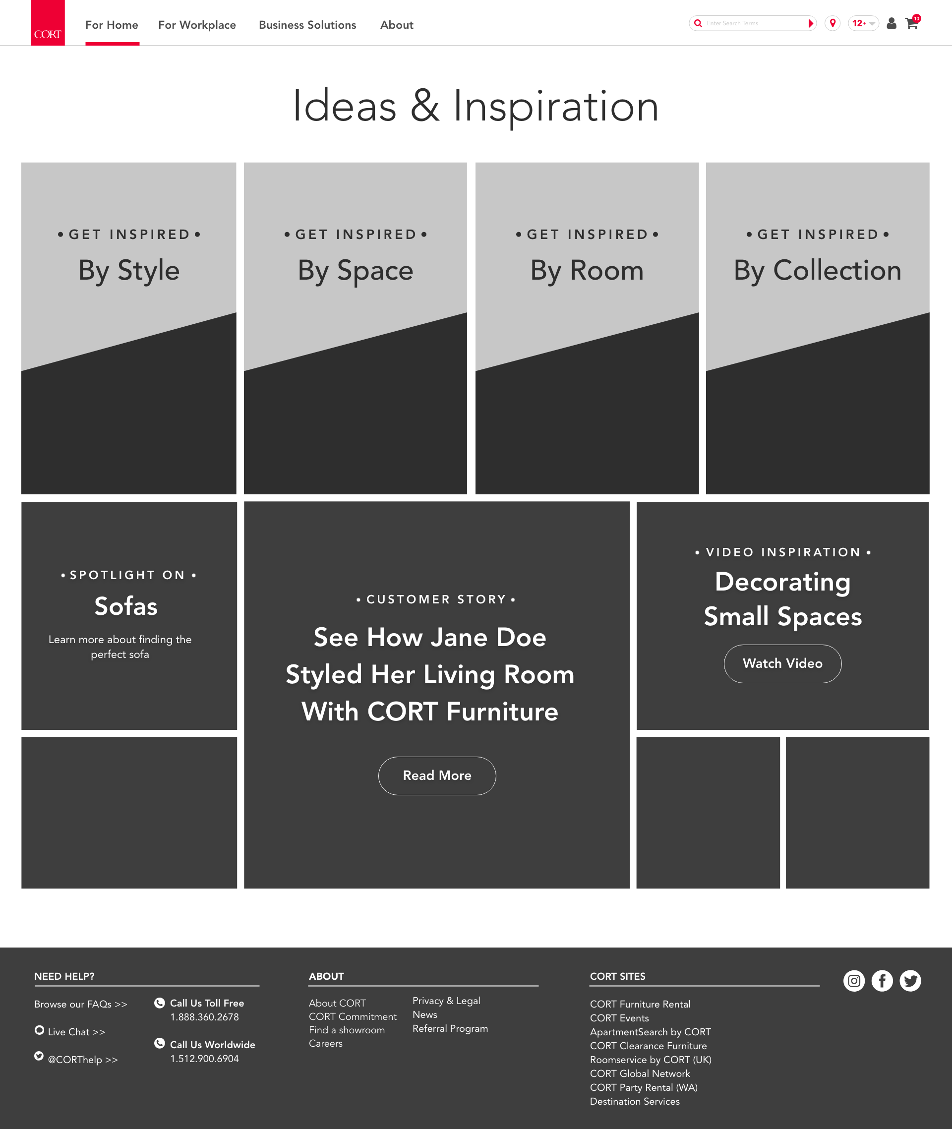
Showcase the furniture collections through an “ideas & inspiration” section of the website; engage and encourage customers to rent more furniture and feel comfortable with design and quality.
Context
Through exploratory research we discovered that customers want more look-books to believe in the design and quality of CORT products, thus we decided to create an “ideas & inspiration” section of the site.
Outcome
I sketched, wireframed and designed content pages (and also utilized or created more modules) to inspire and motivate users to rent more furniture. We actually went through the sketch > wireframe > design process a few times for this project.
Problem
These “ideas & inspiration” pages aim to:
Showcase CORT’s specific furniture collections
Act as style inspiration for the customer
Educate the customers about what makes the furniture unique, including the quality and materials
Lead customers to rent products that they like, and those that pair well
Educate the customers about how and why to rent furniture
Sketches
I brainstormed and sketched out a number of lo-fi wireframes to discuss with my team before moving to hi-fi interactive mockups. Throughout the process, our modules, content, and capabilities changed.
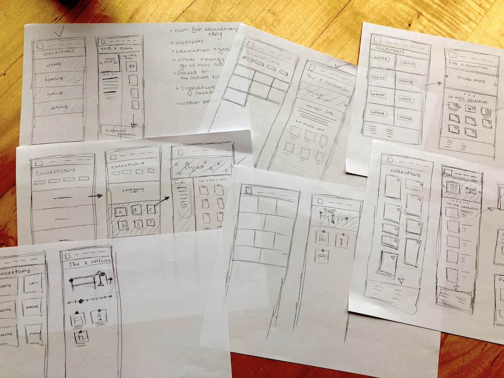
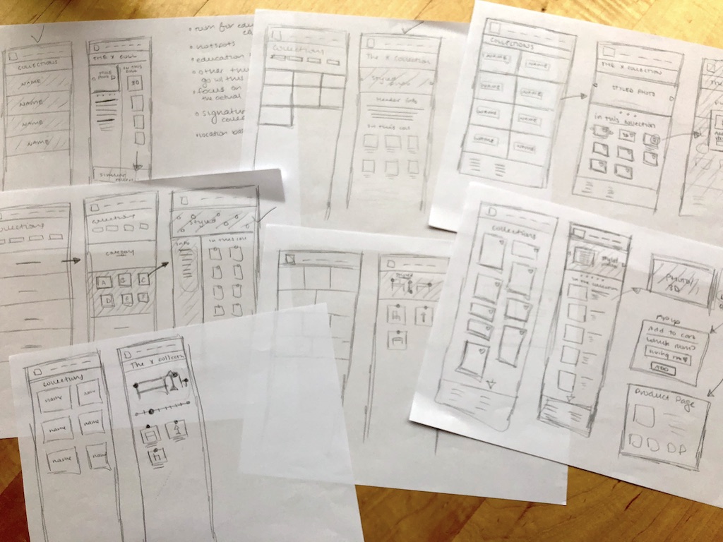
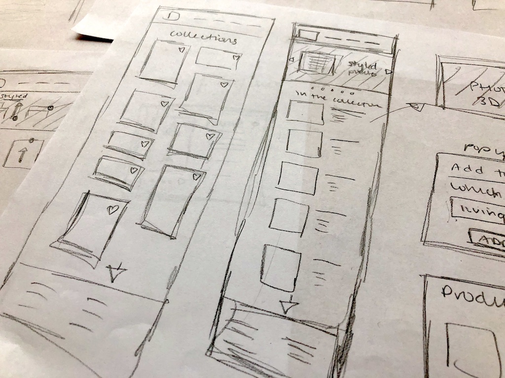
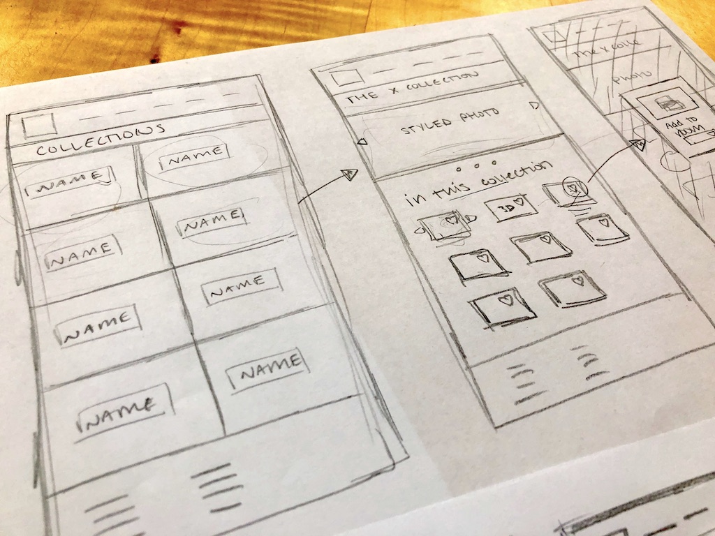
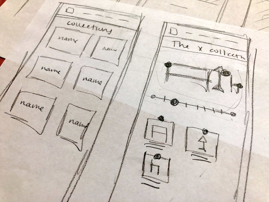
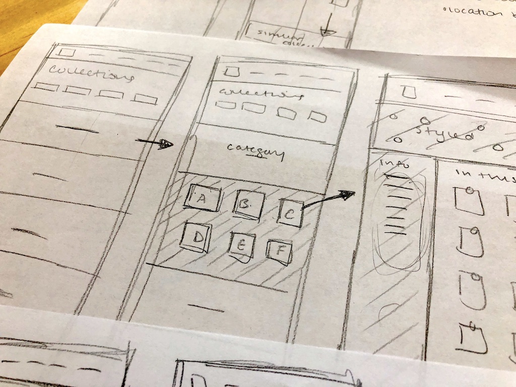
Wireframes
Here are some wireframe concepts for the ideas and inspiration homepage, style guides, and a page for a specific type of style. We ended up with simpler, more succinct designs in the end due to various constraints, like lack of custom content upon launch, and lack of time to create animations that I had suggested.
Mockups
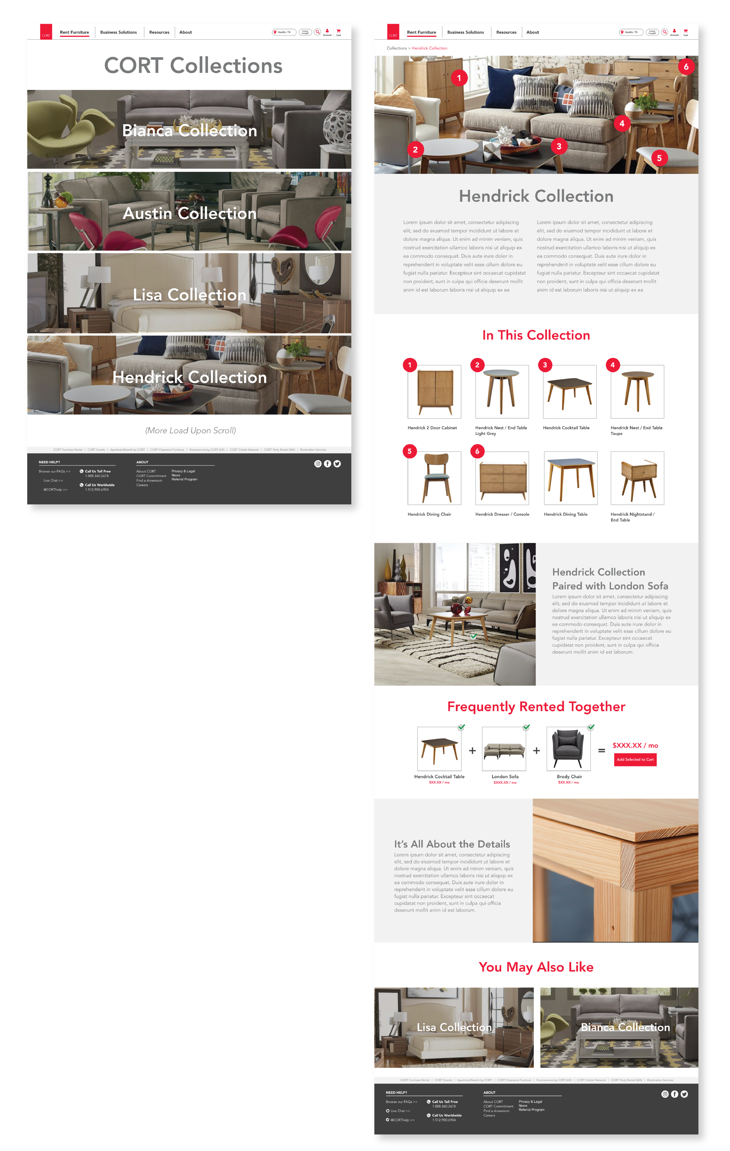
Following are some initial mockup concepts of collections pages.
The first page shows an example of what the overall collections page could look like, and the second is an example of what a specific collection’s page could look like.
Each module is customizable to the collection and the the customer’s location. For instance, collections with higher quality or more unique products may have more educational modules about the materials and designs. For all collections, only product that is available in the customer’s location will be shown in the “frequently rented together” module.
My Last Contribution and Beyond
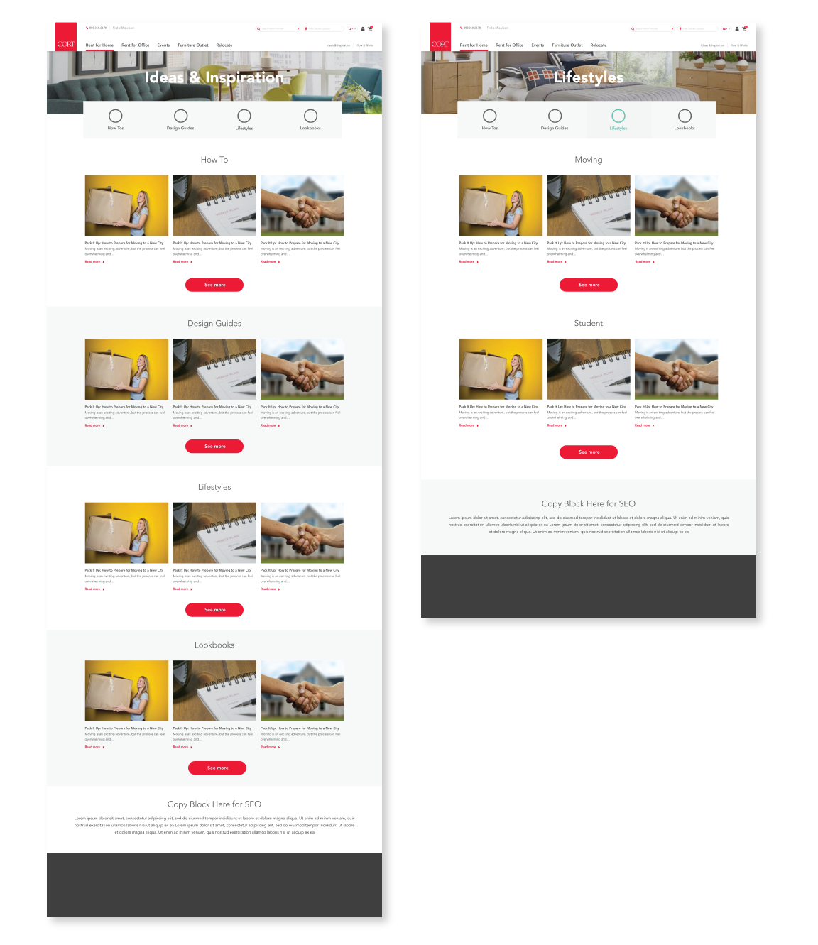
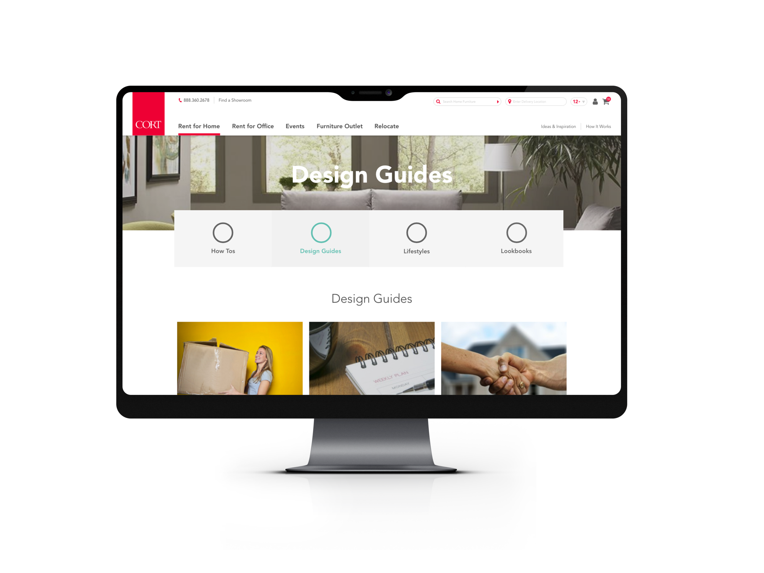
I continued to revise these “collections” page sand “ideas & inspiration” pages, rapidly iterating with team guidance for desktop and mobile. They pretty drastically changed throughout the process, as we realized that creating new content would be a great undertaking. For MVP we decided to only use existing blog content. You’ll see that in my final designs, there are content blocks that link to existing blog posts.
See examples of my final mockups below (with circles as placeholders for icons I later created).
Since my collaboration with CORT , their internal team took over the design and development of the site. You can see the final version live on the site here. It’s relatively similar to what I designed.