
Designing an application submission process for web and mobile
Client
Magna Life Settlements
Role
UX/UI Designer
Skills
Collaboration with CMO, project manager and development team
User flows and web flows
Low fidelity wireframes
High fidelity designs
Rapid iteration
Use existing brand guidelines
Design responsive desktop site and mobile site
2019
Overview
Objective
Design the application process from start to finish, which includes an inquiry for how much a consumer’s policy might be worth and then the application itself. We were looking to increase the amount of users getting policy estimates and convert them to apply online (vs. taking up the phones, which is cumbersome and expensive), as well as make the process easier to use for older audiences.
Context
Magna Life Settlements works with those who are looking to sell their life insurance policies. The process of selling a life insurance policy is typically long and difficult for the consumer. Magna wants to streamline the process by providing online services, like an application system and integration with other health sites.
Outcome
We created a platform to easily and instantly get an estimate for users’ policies. It leads them to an online application that not only guides them through the process but also educates them along the way.
Problem
Selling a life insurance policy is complicated for the consumer — there are many pieces of the process, they may use agents/brokers or do it themselves, it can be difficult to understand policy details, there is private information being transferred, and it is a sensitive topic overall.
These issues also pose difficulties for Magna, especially when creating an online experience.
The user may switch halfway through the experience. For instance, in many cases the agent or broker inquires about the value of their client’s policy, sends that information to their client, and then their client completes the application themselves. In other cases, the consumer may do the whole process; or the agent or broker may do the whole process.
The application itself needs information that can be difficult to attain, such as certain documents or health history.
The application also has to be filled out in a specific way – with personal information filled out first, and then the remaining sections can be filled out in any order.
Magna needs to educate the consumers about selling their life insurance policy — why, how, etc.
Magna needs to be considerate and careful with the private information they are collecting.
Magna should use language that is sensitive to the user, since they are discussing health.
Users and Audience
Consumers: People that are interested in selling their life insurance policy. These tend to be elderly folks who are in need of financial assistance and may be in poor health.
Representatives: Agents, brokers and other representatives.
My Role
Working alongside the CMO, the Senior Marketing Manager (who acted as the project manager) and a small development team, I created all the user flows, wireframes and designs for this project.
Constraints
The audience: Designing for and older generation is an interesting challenge, as we needed to consider things like eyesight (if they have poor eyesight, we should use larger fonts), access to the latest technology (what if their computer screens are not color correct?), and usability (we needed to be sure the process was explained and intended actions were clear).
Small team: Our team was on the small side, but mighty. We had the CMO overseeing the project, with the Senior Marketing Manager doing everything from setting goals to writing copy, me to design all the pages, one front-end developer to execute, and other developers to assist.
Short timeframe: We rapidly iterated on designs and development to work with rather tight timelines.
Design Process
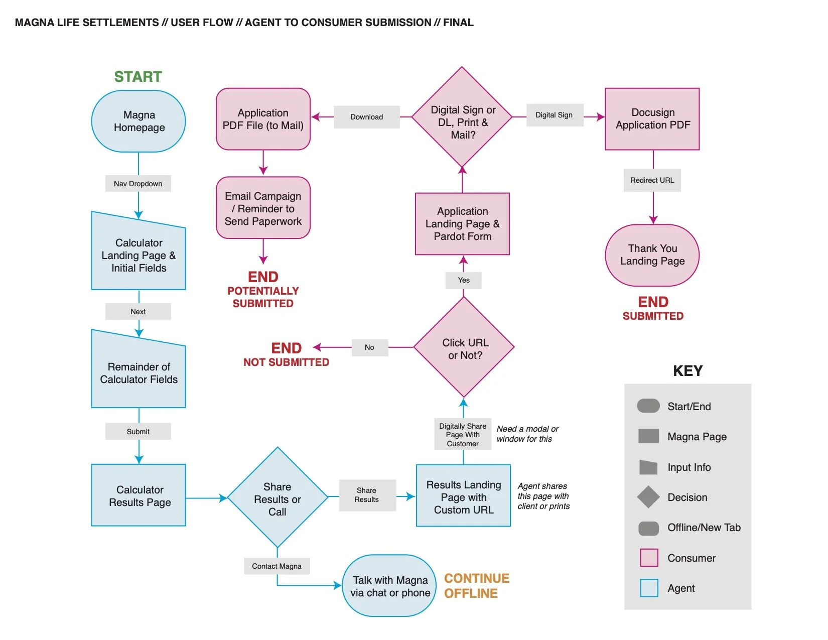
First, we divided the project into two larger pieces: 1) the experience for when an agent inquires about the value of their policy on their client’s behalf, and 2) the application process.
Overall
Magna had recently gone through a rebrand, so we needed to follow the newly created brand guidelines. There were no specific design systems in place, but I pulled styling ideas from the new website (I did create design systems and a pattern library later).
We had to consider the older audience — i.e. use larger font sizes, rich colors, clear language, easy buttons, and educational information about the process.
We wanted a way for consumers to track their progress with selling their policy — it takes weeks or months, and the application is just the first part. Our solution? A custom dashboard. (However, for MVP we had to scratch the dashboard idea).
Inquiry Project
We began by creating a user flow. We aimed to distill this lengthy and complicated process into a simple one. First, the agent would fill out form fields with their client’s policy and health basics, resulting in a valuation for their policy. This valuation page had to include a number of graphs and specific details. The agent was to share that same page with their client, through which the client could begin the application process. We also needed an easy way for the consumer to understand how to download and/or print the page, since the older audience may be inclined to do so.
Once we finalized the user flow, I created a number of low-fidelity digital wireframes for each screen. With feedback from the rest of the team, I iterated on the wireframes. Then I skinned them using existing brand guidelines and design systems, which I distilled from the newly rebranded website.
The front-end developer worked on executing the designs. I provided feedback to help ensure consistency with the design and the rest of the site.
Application Process
I kicked off this project by creating another user flow. The flow began with the final step of the previous inquiry project and ended with application submission. Then I designed a number of low-fidelity wireframes.
Once those were approved, I skinned them with the same styles as the existing website and previous project.
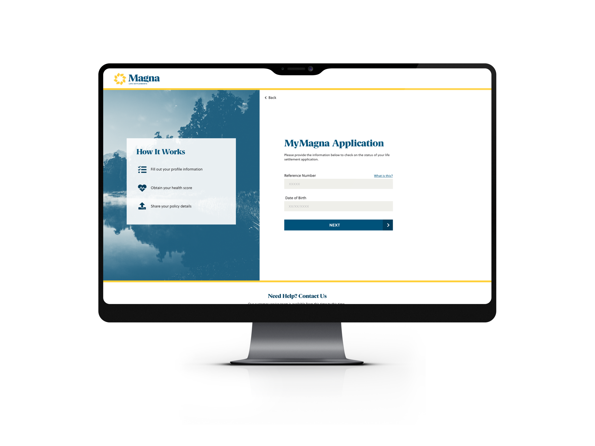
Regarding flow structure and UX : after the inquiry experience, the consumer received an email with a unique code — sort of like a flight confirmation code — as well as a custom link. The custom link brings them to a login page, then they proceed to the application itself.
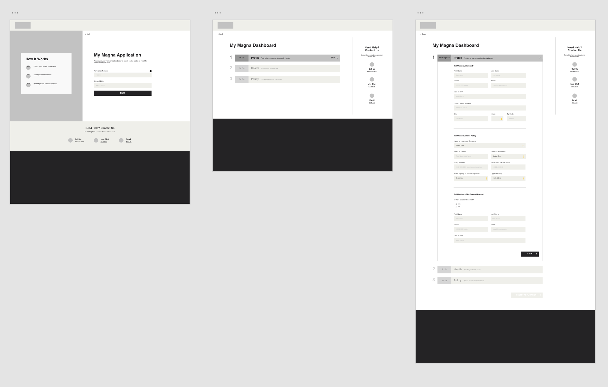
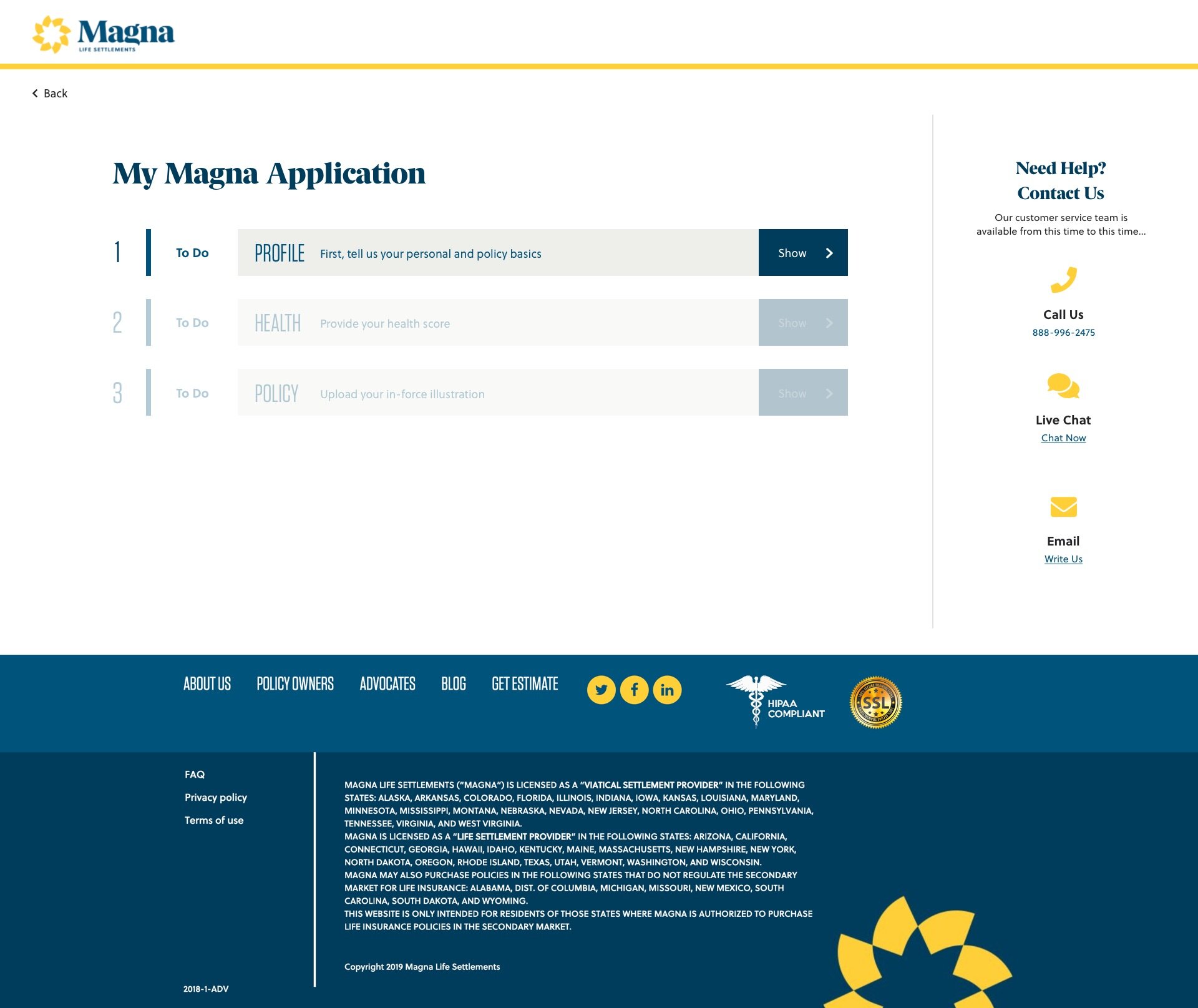
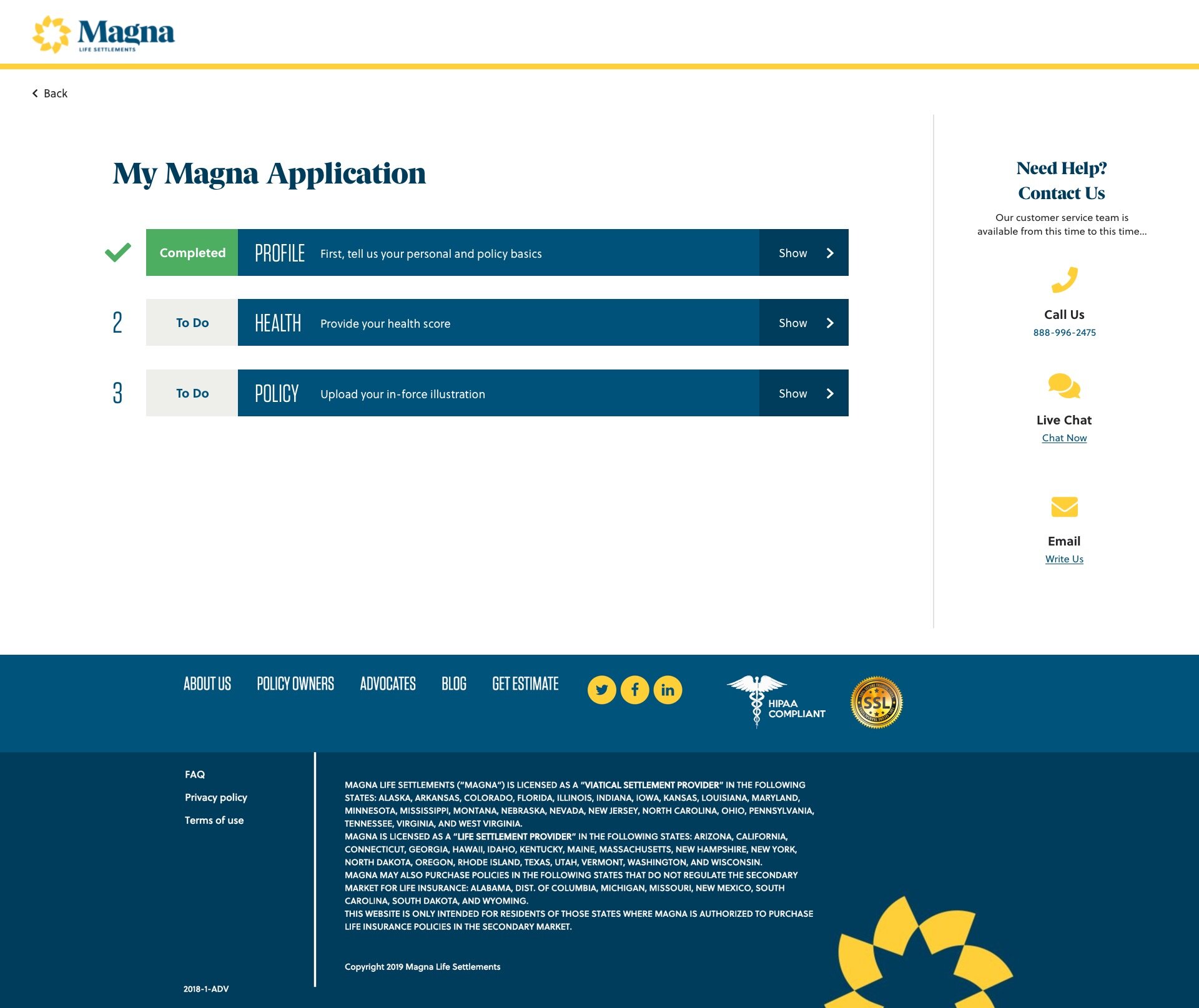
We separated the actual application into three parts: 1) personal and contact information, 2) health information, and 3) policy information. Part 1 had to be completed first; then parts 2 and 3 could be completed in any order.
After reviewing a few concepts, we decided to create a large, clear accordion. Upon landing on the application page, part 1 is live — they can only fill out that part — while parts 2 and 3 are faded in color to demonstrate that they are disabled.
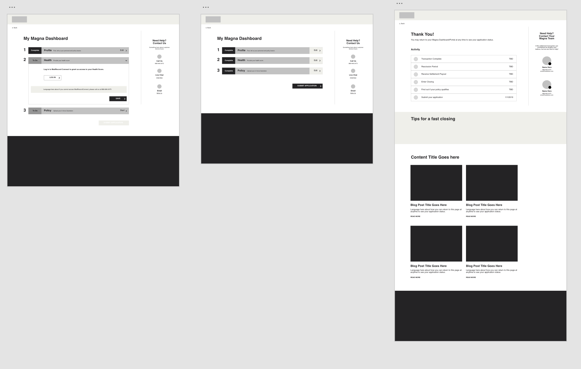
Once the user completes part 1, it is clear with green “completed’ language and a check mark; then parts 2 and 3 become enabled. The user can technically complete these in any order; however, we automatically bring them to an open part 2 section upon completing part 1.
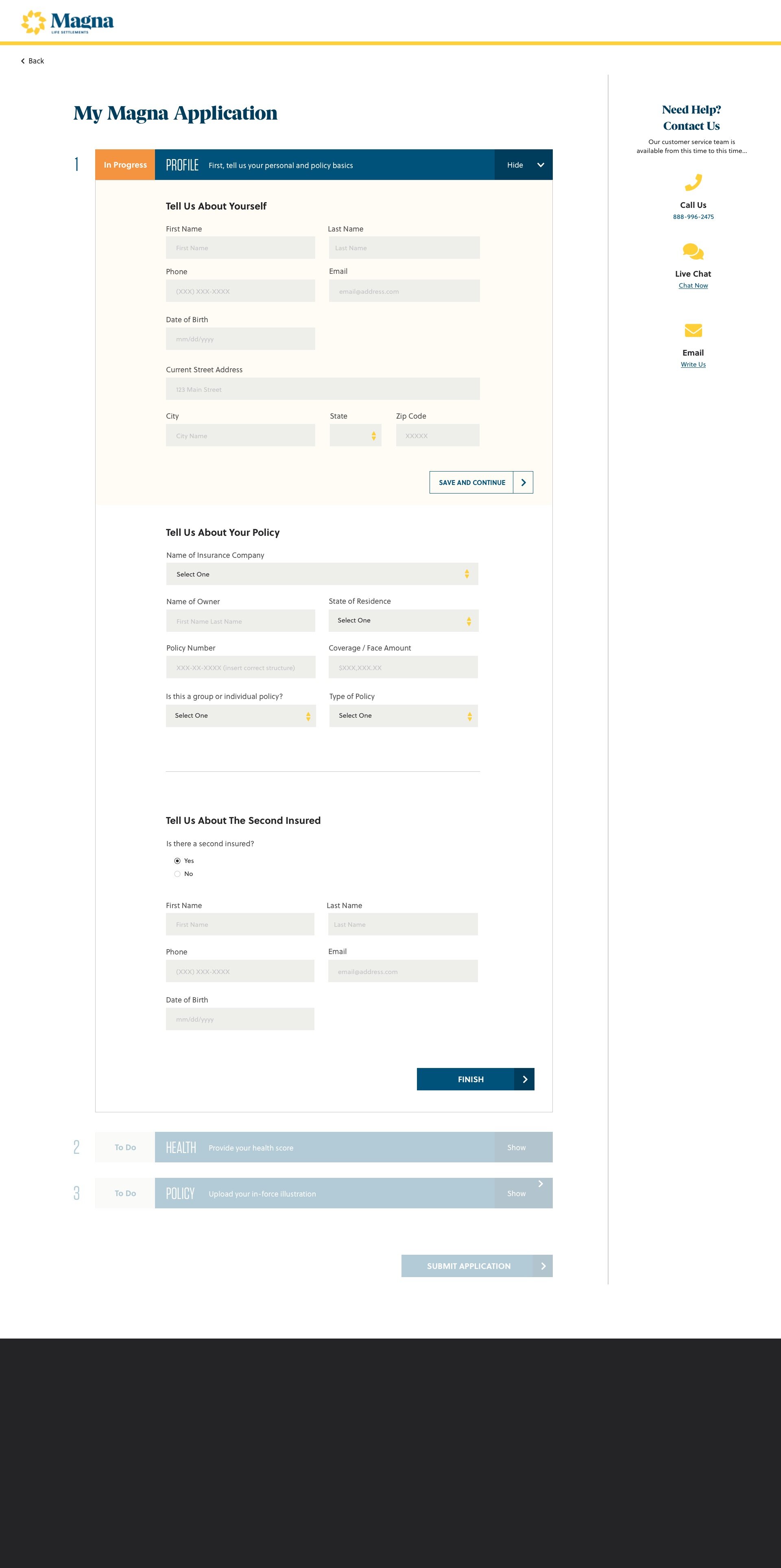
Throughout the experience, we included a few videos and supplementary details explaining complicated parts of the application. All of these decisions guide them through the process and ideally reduce clicks and confusion.
Once they fill out all parts of the application, all sections are green with check marks, and the “submit” button enables. They click that to review their application information in a modal, receive a thank-you confirmation screen, then continue onward to a dashboard showing their progress.
The dashboard is reminiscent of Redfin’s dashboard or even Domino’s pizza tracking page. It visually shows the user where they are in the policy-selling process (the application is just the first part!), has contact details for their Magna representative, and also features educational information. The user can re-visit the dashboard page at any time using their confirmation code or custom link.
(Please note: for MVP we had to change the dashboard to a simpler thank-you page.)
Lastly, we applied these designs to mobile as well, in order to create a completely responsive experience.
Lessons Learned
As of May 2019, we are still in the process of finishing and launching the complete application flow, conducting user research, and iterating as needed. I am curious to see how users interact with the experience, as well as gather feedback and distill key lessons.