
Designing tasks and alerts features to encourage user engagement for couples’ budgeting app

Client
Zeta
Role
UX/UI Designer
Skills
Collaboration with CEO, product manager, and development team
Low fidelity wireframes
High fidelity designs
Rapid iteration
Use existing design systems and pattern library
Design for mobile and web apps
2019
Overview
Objective
We needed a way to clearly show users that they had “tasks” to tackle — like categorizing a transaction, and “alerts” to see — like a bill was paid. We wanted to increase engagement with these features.
Context
Zeta is a consumer-facing mobile and web app that helps couples with budgeting and tracking finances. For budgeting apps to work well, users need to categorize their purchases and interact with it regularly. Users were not doing this enough, so we hoped our new designs would make it less cumbersome and more satisfying.
Outcome
We brought the most important alerts to the forefront, as to not overwhelm the user with all of them at once. We added a fun, satisfying screen when they reached inbox zero.
Problem
The app gets smarter the more a user takes actions like categorizing a transaction or paying a bill. The problem was that more than half of users were leaving transactions uncategorized, for instance, or ignoring other tasks and alerts. Some users reported that they felt like these actions were chores.
Our challenge: to make categorizing transactions, doing tasks, and reading alerts more satisfying and enticing for the user to do, and also make it clear what they have to do and what they have already done. Ultimately we wanted to increase the percentage of users who took action.
Users and Audience
Zeta’s target users are all couples, but couples may look at their finances in varying ways. For instance:
The couple may have all their money merged into joint bank accounts.
The couple may have some of their money merged into joint bank accounts, and some in separate bank accounts. They may have their income go into either type of account.
The couple may keep all money in separate, personal bank accounts. Perhaps they pay each other back for purchases, or one person may cover utilities while the other person covers internet expenses.
No matter how they set up their accounts, some couples consider all of their money one and the same, and some couples consider some of their money (or all of their money) personal and separate.
What’s more: some individuals have their bank accounts linked to the app and auto-import, while others manually input every expense and transaction.
My Role
Working alongside the CEO, product manager, and development team, I created all the wireframes and designs for this project.
Constraints
Varying audiences: We always had to consider the different types of audiences for each problem we tackle.
Small team: We had a team of only a few people to work on the entire app.
Quick timelines: We rapidly iterated on designs and development to work with rather tight timelines. The development team was fast (which was great!) and our designs had to keep up.
Brand styles: While we did not have format brand guidelines, we worked within the app’s existing design systems. I found to be challenging to work with some of the color combinations and styles.
Existing app and users: The app was already built, live, and had existing users. We tackled little pieces at a time, create smaller projects for ourselves, so we would not shake up the users’ experience with many jarring changes all at once.
Design Process
First, we divided the project into two: mobile and web. We tackled the mobile experience first, then translated it to the web app after.
Overview
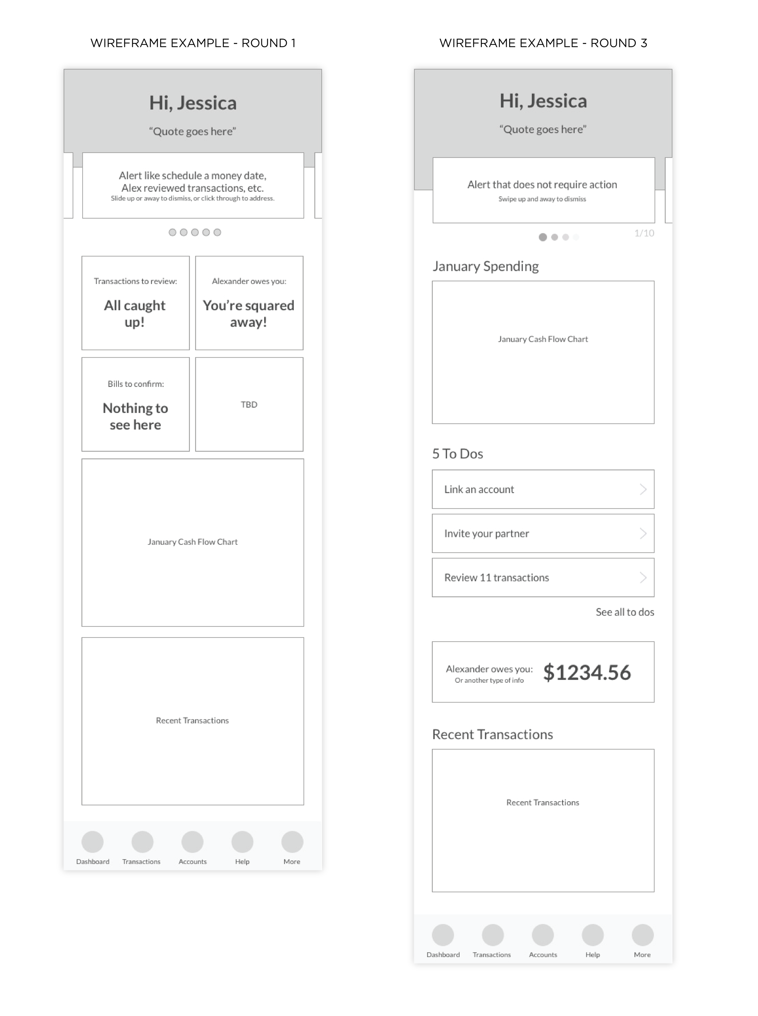
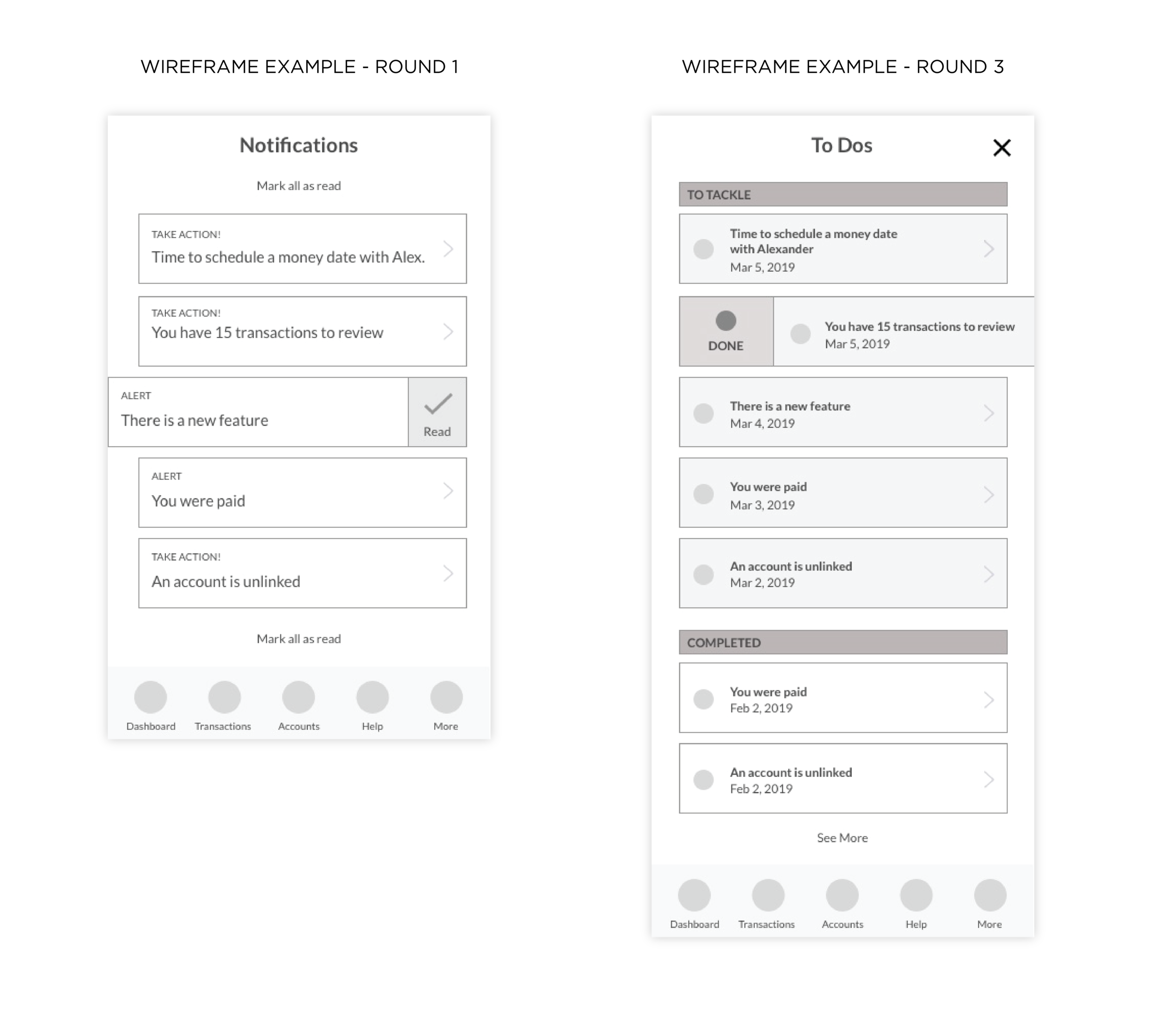
I began by creating a number of low-fidelity wireframes to discuss and review with the product manager. We rapidly iterated on low fidelity wireframes and high fidelity mockups throughout the project, doing upwards of 5 versions of each. Here are a few examples of round 1 vs round 3 wires.
Together we narrowed down the options, and I refined them. The CEO and development team then took a look, and from there, I refined and iterated further. We repeated this process until we were happy with the final wireframes.
Then I skinned the wireframes and created a number of high-fidelity designs in Sketch, linked together as a prototype. Again we went through the same iteration and feedback process until we came to a conclusion and final design.
Alert Cards
On mobile: We made alert cards that appear one at a time at the top of the main overview page that the user sees when they open the app. They can swipe the alert away easily to dismiss it, or they can click on it for more details. A number in the corner shows how many alerts they have remaining.
On desktop: The top right column on the web app shows alerts — one at a time – with two possible actions: review or dismiss. The user can click “review” to see more details or click “dismiss” to remove the alert. Once they take an action, the next alert will populate. Again, a number in the upper right corner shows how many alerts they have left. When they check all alerts, we have a card with fun copy to help them feel satisfied and that they hit inbox zero.
Tasks to Tackle
On mobile: We have the three most important tasks listed out on the main overview page. The user can click on a task, which brings them to the screen that requires action (i.e. if they have to pay a bill, it will bring them to the bill’s page). Or they can click on “See All” to head to a screen with all their tasks listed out. This screen includes all of the to-dos and their completed tasks so they can go back and review. At any time, they can mark a task complete or make it live again.
We included emojis next to each type of task for quicker identification. When all tasks are complete, we have congratulatory copy for a fun, motivating inbox zero to make these actions less chore-like and more satisfying!
On desktop: Underneath the alert card on the web app, we included the top three tasks they have to tackle. The user can click on a task, which brings them to the page of action. Or they can click on “See All Tasks” to go to a complete page with all of the to-dos. There they can also click on a task to be brought to the page of action or see completed tasks as a summary. At any time, they can mark a task completed or bring it back to life. We still included the emojis next to each task and a fun completion card when they hit inbox zero.
Development
The developers quickly implemented some of the pieces. As of May 2019, some of the pieces are still to come.
Lessons Learned
As of May 2019, we are still in the process of finishing and launching these features, as well as testing users’ interactions and gathering feedback. I am particularly interested in seeing if users are actually reviewing more transactions, doing more tasks, seeing more alerts and finding all of these features more fun and less burdening.